BASE Milano
Art direction and rebranding project for the visual identity of BASE — a multifunctional cultural center in the Tortona area of Milano, that promotes social innovation and cultural cross-pollination between arts, businesses, and technology.
The goal was to provide a flexible, expressive, and sustainable visual identity. Stylistic and language choices were guided by the aim to address the diverse needs of such a versatile and complex reality.
2020—23
Milan
ART DIRECTION ⁄ VISUAL IDENTITY ⁄ GRAPHIC DESIGN
Chiara Costa, Sara Maragotto
EXHIBIT DESIGN
Chiara Costa, Sara Maragotto, Eleonora Diana, Caterina Gabelli
Construction — Maurizio Fò, Agostino Nardella
Assistance — Luca Bretani, Maddalena Medri
Technical sponsorship / paint — Rezina
Font — GT Flexa by Grilli Type
BASE team — Giulia Capodieci, Francesca Napoli, Agnese Da Col
BASE junior graphic designer — Stefania Zanetti
Photo credits — Alecio Ferrari
RE-LOADING
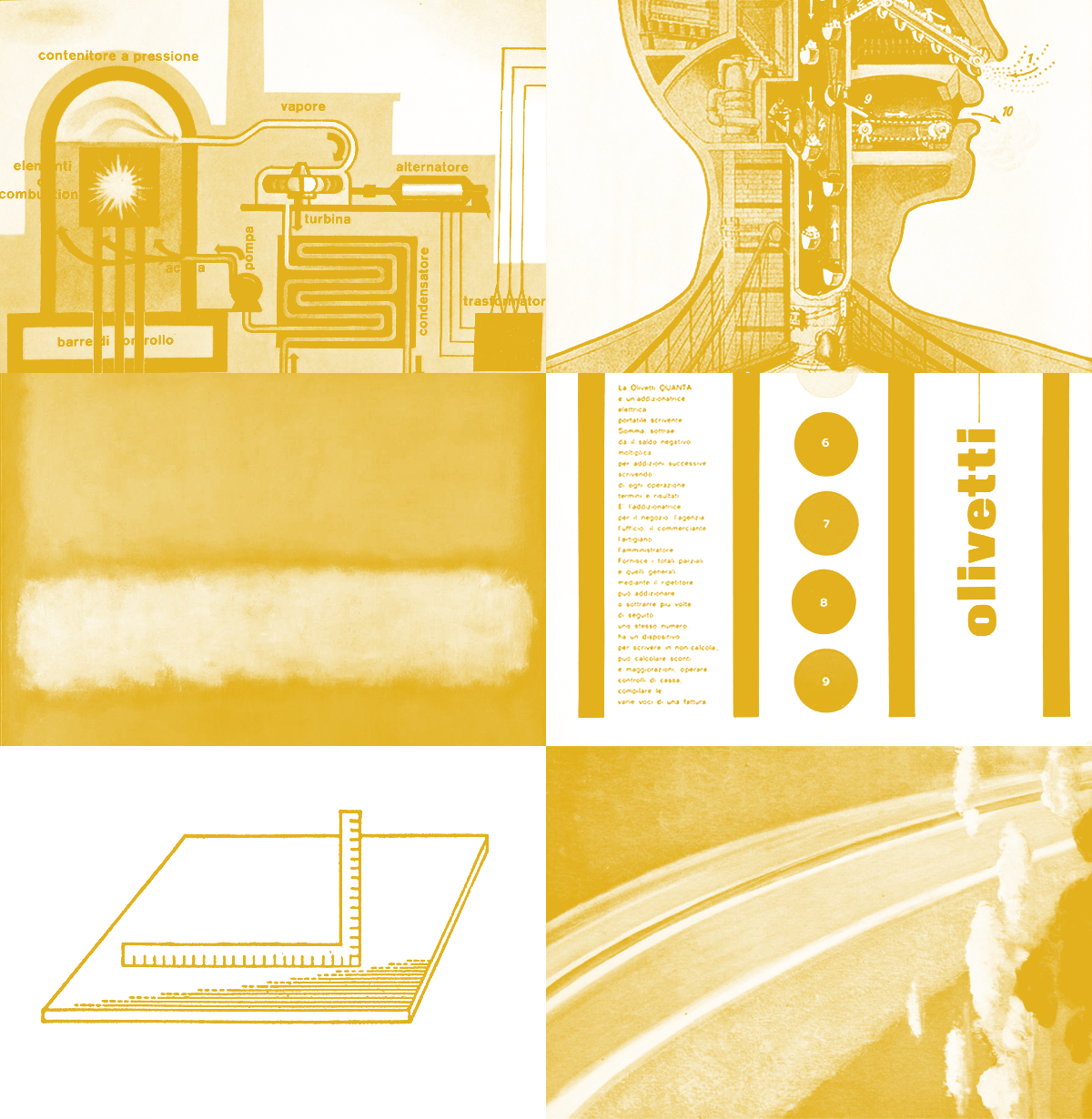
During the most uncertain moment of the pandemic, we delved into the visual imagery of the Italian industrial boom era, characterized by great confidence and graphic quality. We provided a renewed language for the values of BASE, a place that aims to be a new cultural industry - no longer just a factory, but a complex living organism.
NEW BASIC
The original logo has been retained for its impact and recognizability. the linear element of the underline becomes the fundamental element for the construction of grids, pictograms, and spatial organization. A gentle rigor serves as the basic structure to accommodate an assortment of variations. The graphic language is clean but never extreme: the zero degree is the nearly white ⁄ nearly black.
A WIDER RANGE
The extensive TYPOGRAPHIC SYSTEM of GT Flexa font was chosen as the new typeface. Its personality and dynamism, derived from its variable structure, allow for a consistent approach while accommodating the multiple needs of the space, which not only hosts but also produces diverse content.
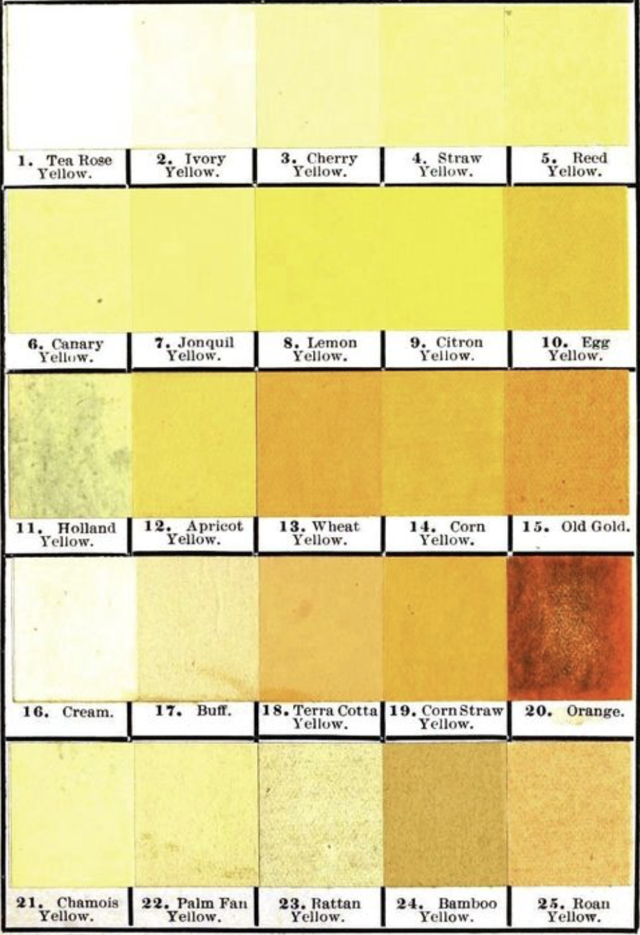
The concept of a wide range was also applied to the COLOR PALETTE. Drawing inspiration from the existing elements of the space, the entire spectrum of yellow was chosen as the identifying color, avoiding rigid and unsustainable color codes.
MORE ASSERTIVENESS
—
MORE COMMUNITY
—
MORE SPECIFICITY (MILAN ⁄ ITALY)
—
MORE COLOR
—
MORE ARTS & CRAFTS
—
MORE HYBRIDATION
—
MORE HYBRIDATION
—
MORE WOW
—
MORE ASSERTIVENESS — MORE COMMUNITY — MORE SPECIFICITY (MILAN ⁄ ITALY) — MORE COLOR — MORE ARTS & CRAFTS — MORE HYBRIDATION — MORE HYBRIDATION — MORE WOW —
NEW VISUAL MANIFESTO
2020—23
The rebranding process was carried out in multiple phases, with interventions in key spaces of the huge cultural center as well as its online presence — with the valuable support of the entire BASE team. Rather than a revolution, we conducted a revamping on multiple fronts, putting the flexibility of the developed open system and the rules of the game we set for ourselves to the test.
From micro to macro: business card and external sign.
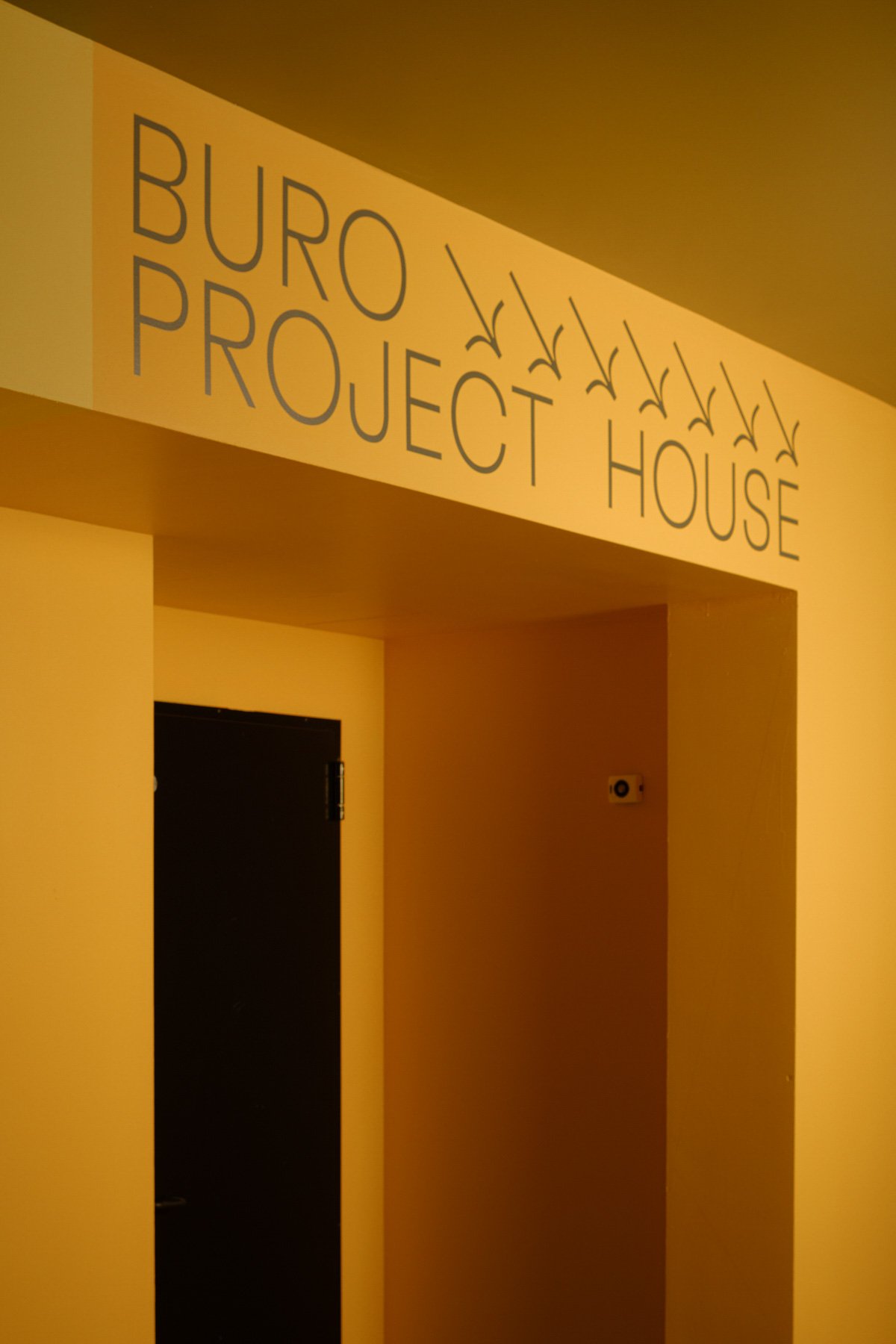
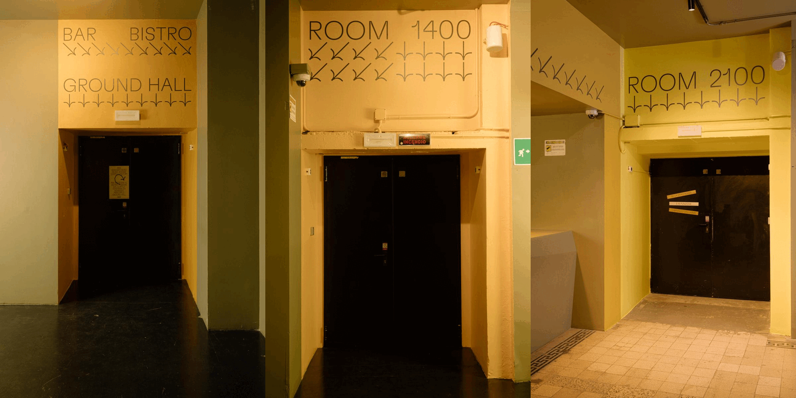
The GROUND HALL has been transformed through a chromatic intervention, using Rezina paint. The doors feature color combinations in an extended range of yellow to create vibrancy and rhythm in the large hall.
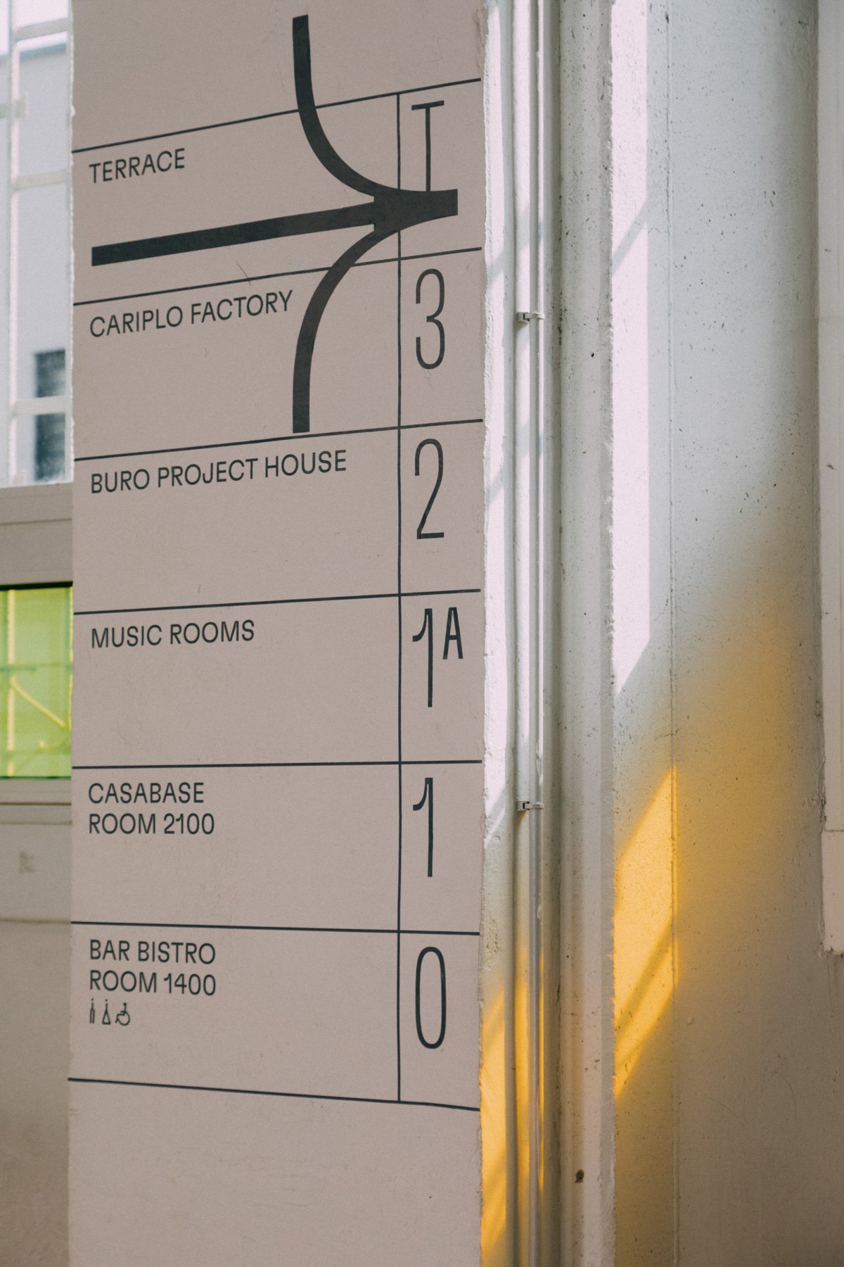
The TEMPORARY SIGNS combine the sharp graphic grid with a variety of modular and spontaneous pictograms.
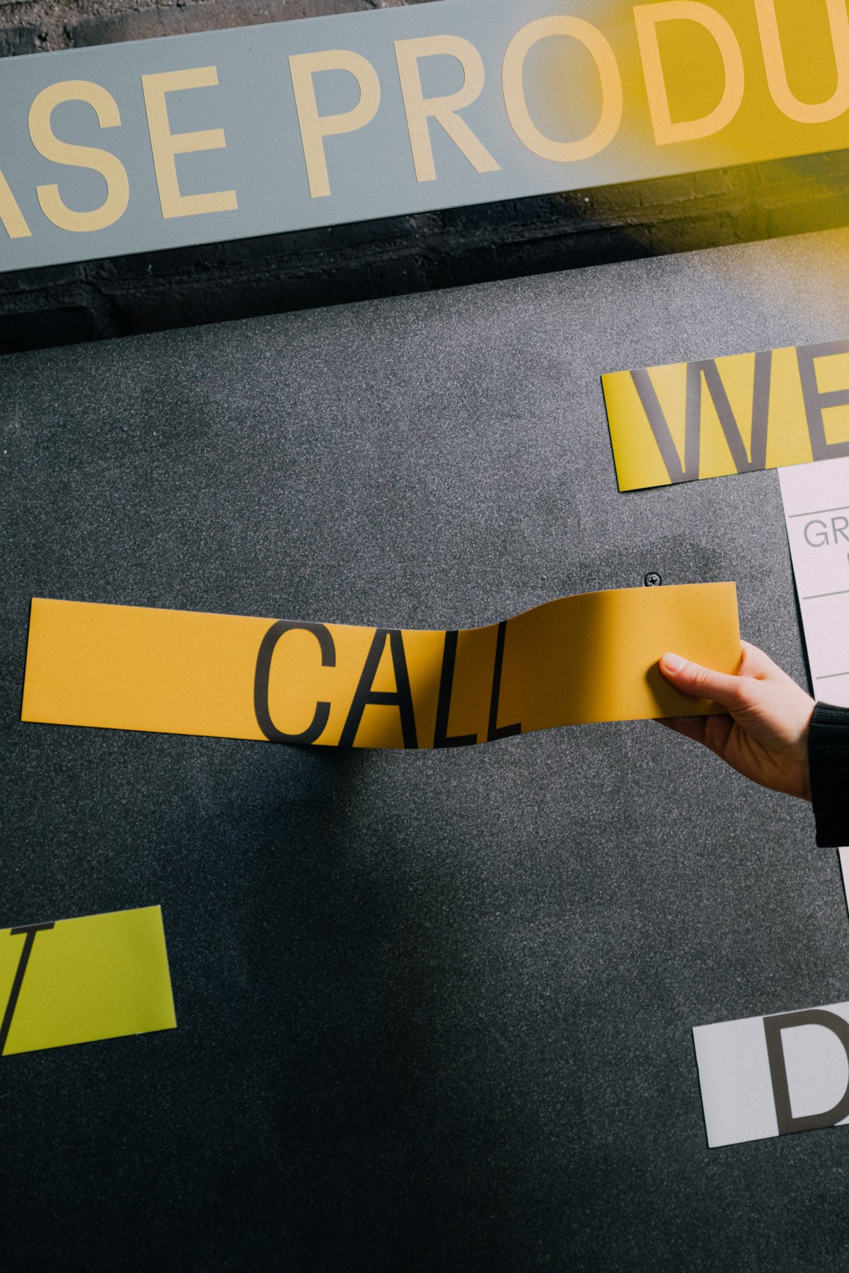
The multifunctional BACHECA / bulletin board welcomes guests at the entrance. It consists of an institutional section, showcasing the history of BASE and the redevelopment of the former Ansaldo factory spaces, an informative section featuring the daily program of events and festivals, and a kind of map-manifesto outlining the goals and values of the cultural center.
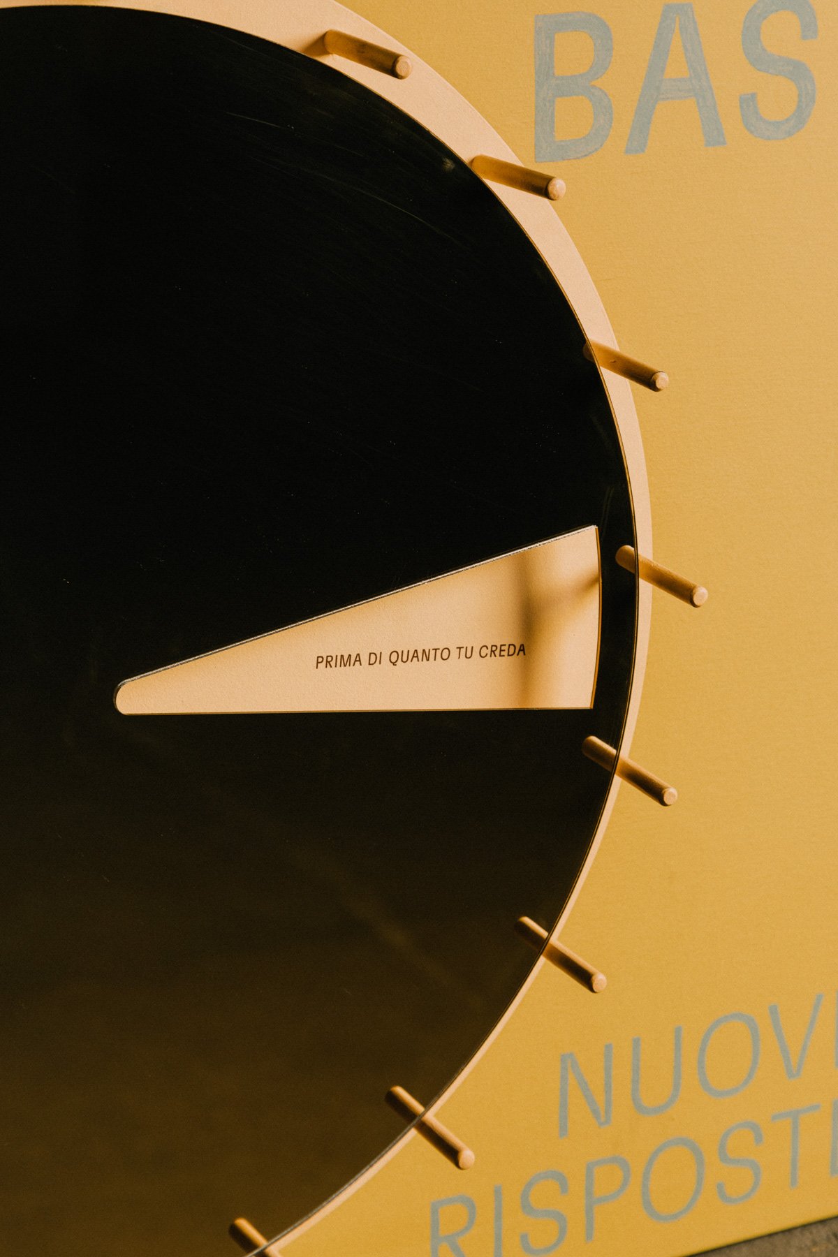
Inside the Bacheca / bulletin board, we included a handmade ORACLE for self-reflection. Created during the pandemic, it prompts 'new questions' and reveals 'new answers' to those who wish to engage with it.
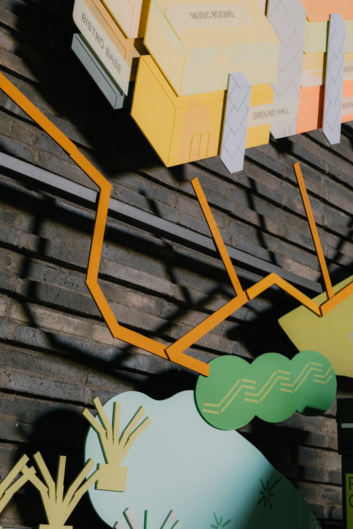
The semi 3D, hand-painted MAP of Base illustrates the complexity of its offerings and the coexistences that occupy its 12,000 square meters. Some spaces have a fixed functions and are accessible to the general public, while others have temporary purposes for specific users, such as the large coworking area.
The large STAIRCASE that leads to the different areas of BASE (offices, hostel, co-working, exhibition spaces) underwent a complete restyling, incorporating the principles of rebranding into the space. Typography and color interventions aim to combine clarity and elegance with the dynamic and multifaceted nature of the place.


