
Ca’ Select
Exhibition design, art direction, visual identity, content research and production for the multifunctional space of the aperitif liqueur brand Select — the new home of the authentic Venetian spritz in the Cannaregio district.
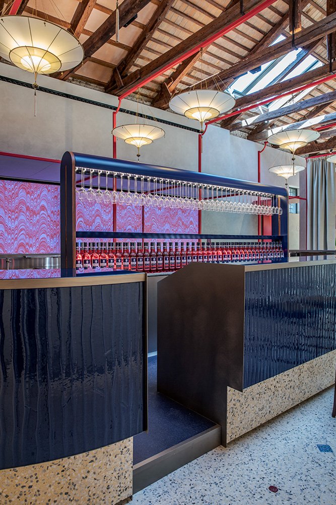
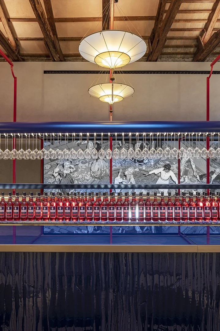
The architectural and interior design project by studio Marcante-Testa involved the transformation of a 19th century industrial building into a space with four distinct areas: bar-mixology, events, exhibition, and production for the maceration phases of the main raw materials.
2023
Venice
EXHIBITION DESIGN / ART DIRECTION AND CONTENT
Chiara Costa, Eleonora Diana, Caterina Gabelli, Sara Maragotto
VISUAL IDENTITY AND GRAPHIC DESIGN
Chiara Costa, Sara Maragotto
ORIGINAL PHOTOS AND ILLUSTRATIONS
Caterina Gabelli
EXECUTIVE PRODUCTION
Alice Drago / Epica Film
ARCHITECTURAL AND INTERIOR DESIGN PROJECT
Studio Marcante-Testa
PROJECT MANAGEMENT
MindTheGap
SF Project manager — Marilivia Minnici
Architectural consultation — Giovanni Tironi
Assistance — Anna Baldo, Luca Bretani, Maddalena Medri
·
Iconographic research — Livia Satriano
Concept and text definition — Francesco Bernardi
Text and copywriting supervision — Tania Loschi
Historical research — Giulia Zornetta, Francesco Bernardi
Historical consultation — Carla Coco, Flavio Birri
Translations — Ellise Fuchs Piva
Motion graphics — Luigi Sorbilli
Mural Painting — Il Letterista
·
EXHIBIT AUDIO
Executive production — Jonathan Zenti
Music and sound Design — Matteo Sandri
Production assistance — Amedeo Berta
With the participation of — Yoko Yamada
·
ARCHIVES
Archivio Cameraphoto / ©Vittorio Pavan; Archivio Ri-Prese – Memory Keepers; Studio Willy Rizzo / ©Willy Rizzo; Archivio Storico Gruppo Montenegro
·
PHOTO CREDITS
Helenio Barbetta; Matteo de Mayda (making of)

VISUAL IDENTITY
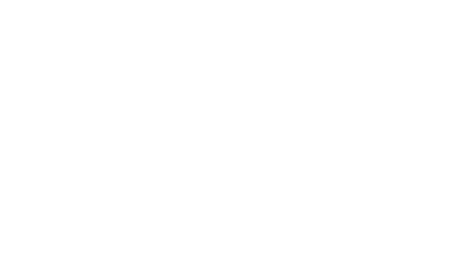
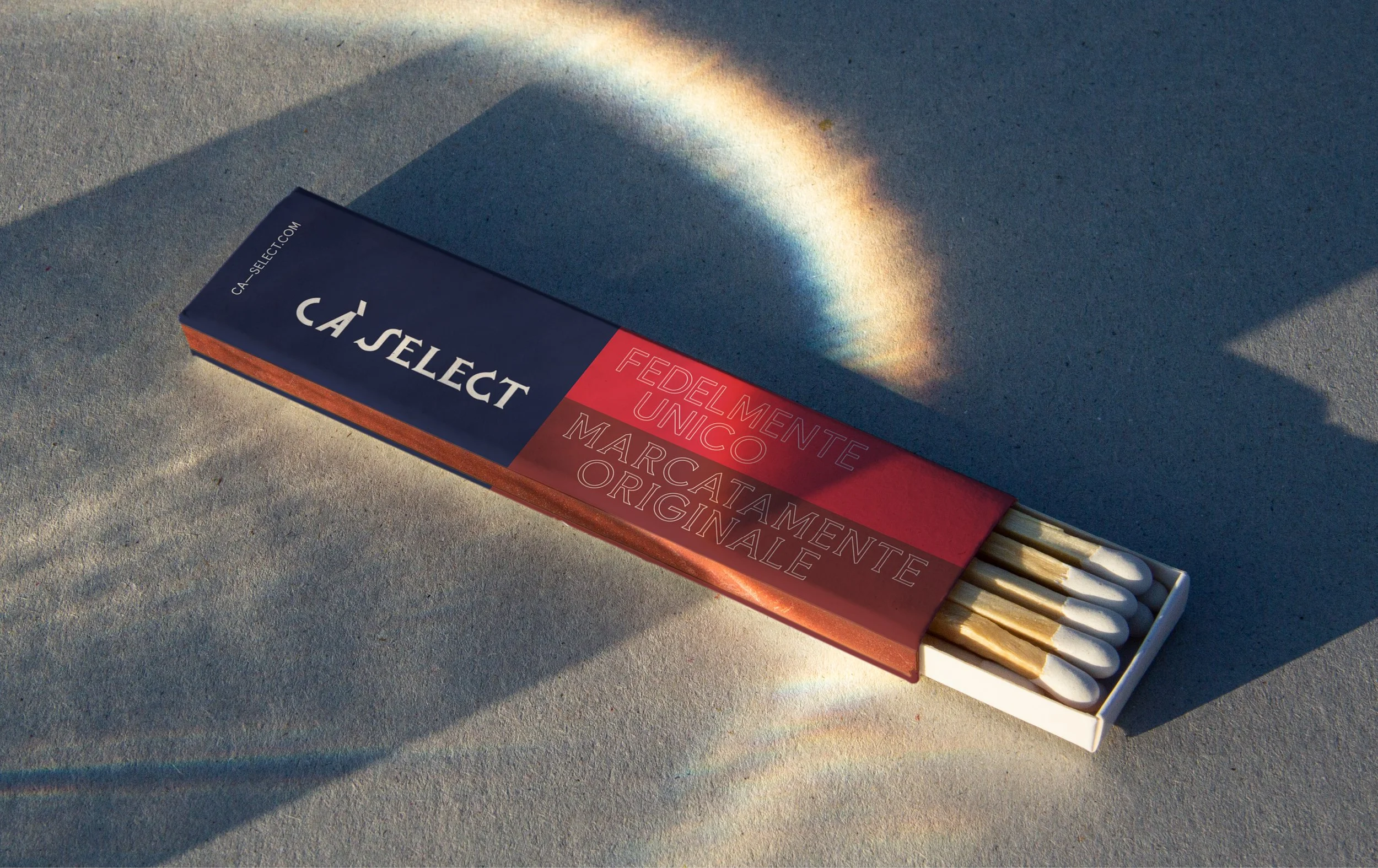
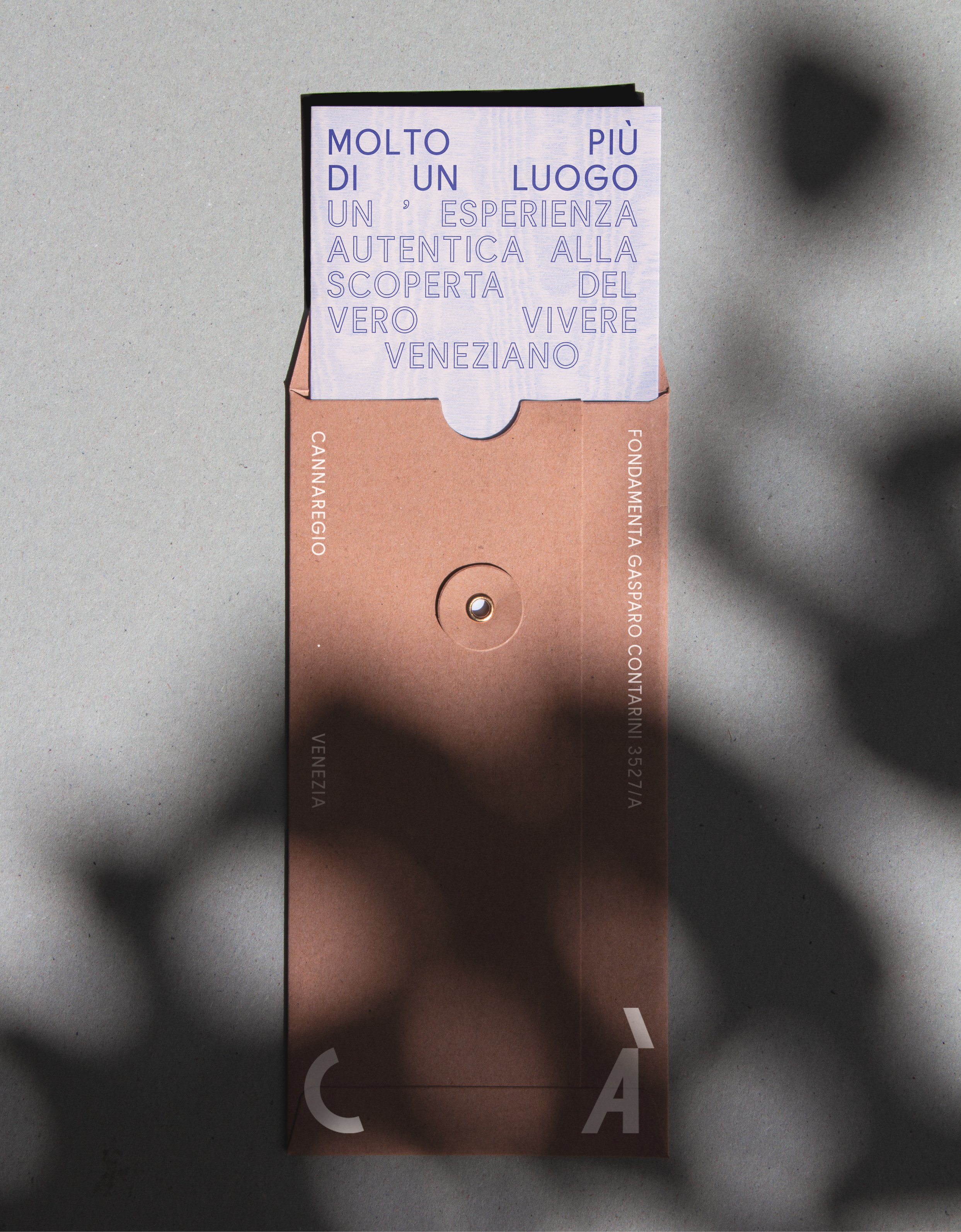
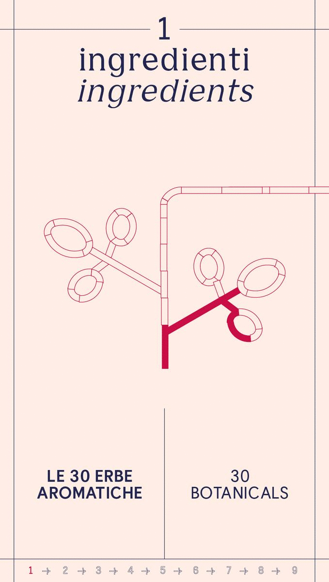
The graphic identity of Ca’ Select incorporates a blend of visual elements, linear patterns, and illustrations offering a unique interpretation of Venetian artistic aesthetics, achieving a balance between vintage style and contemporary clarity.
LOGO AND TYPE
The logo is an adaptation of the Select logo, with the addition of the word CA', created by using an original typographic design. The logo's dual nature, consisting of distinct traditional and contemporary elements — emphasizes the strong connection with the brand history. Furthermore, it provides an independent, coordinated, and recognizable space for the visual identity.
The multifunctional nature of Ca’ Select is reflected in a typographic language that is both distinctive and adaptable to the diverse functions of the space. The textual elements make use of the Bianco typeface by the AlfaType foundry, in both its Sans and Serif versions.

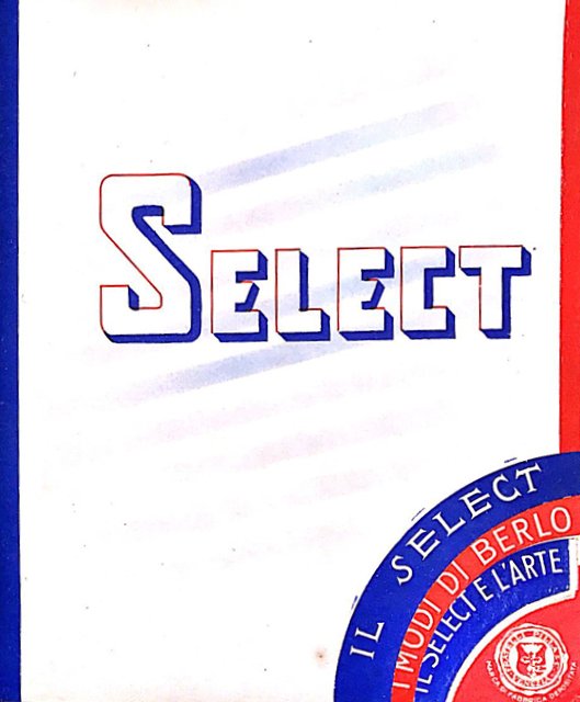

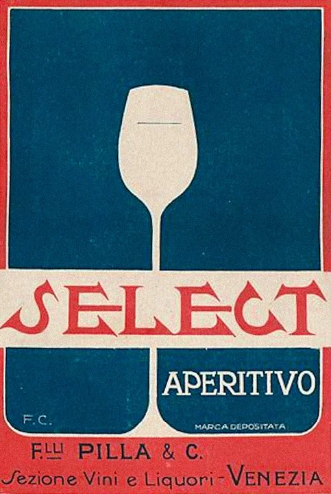
The starting point: graphic references from the origins of the brand, from 1920 onwards
GRAPHIC PALETTE
The DIAGONAL TRUNCATION element from the logo serves as a generator of patterns and decorations. Flexibility and variety are enhanced through the interplay of solid and empty elements, achieved by the use of OUTLINES.
The COLOR PALETTE extends from the original brand hues, incorporating pastel shades inspired by a Venetian sense of decoration and coordinated with the interior design project.
The graphic elements that constitute the visual identity play together in the LOGO MOTION designed for the LED wall in front of the scenographic Murano glass bar counter.
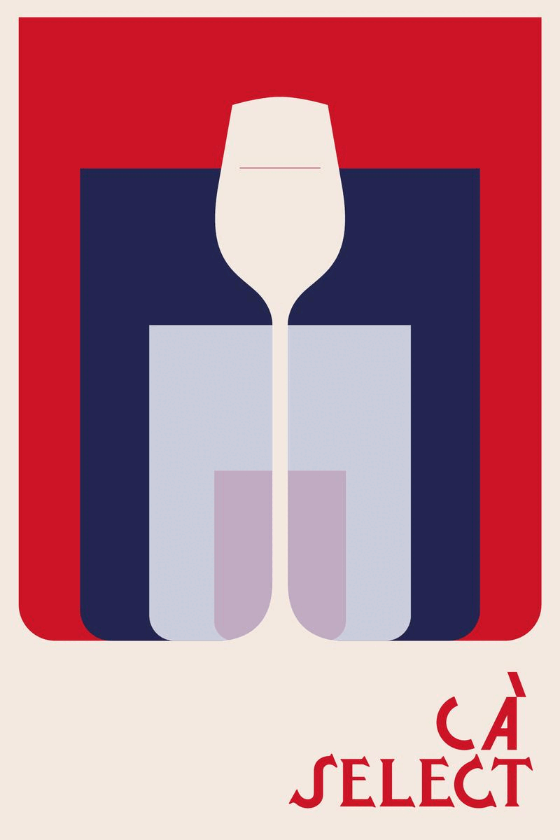
KEY VISUAL
The key visual interprets the iconic silhouette of the glass from the original 1920s label. The backdrop of a stylized theater curtain conveys its nature as a layered and multifunctional space, closely linked to Venice's tradition and cultural vitality.

MATERIALS AND VARIATIONS
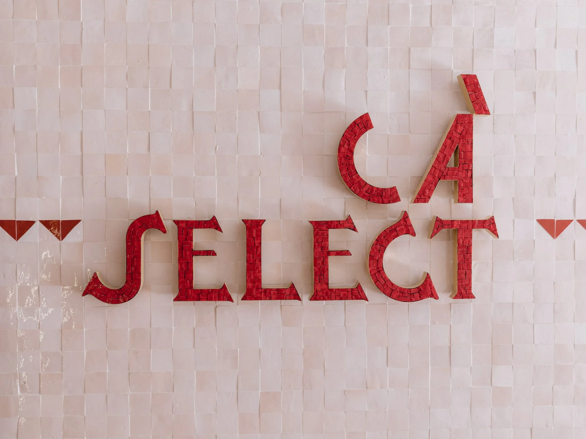
Logo created in mosaic by Orsoni, historic Venetian company


BRAND EXPERIENCE
THE EXHIBITION ROUTE
I. SELECT BAL ORIENTAL
Video installation — An exclusive atmosphere
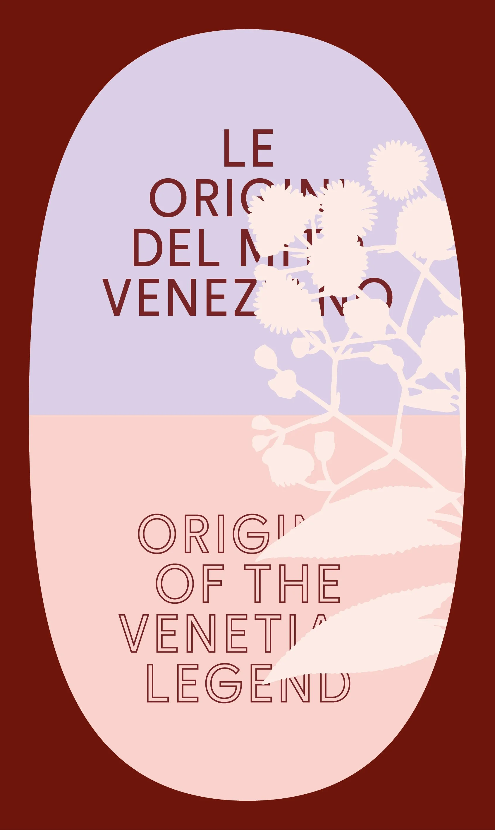
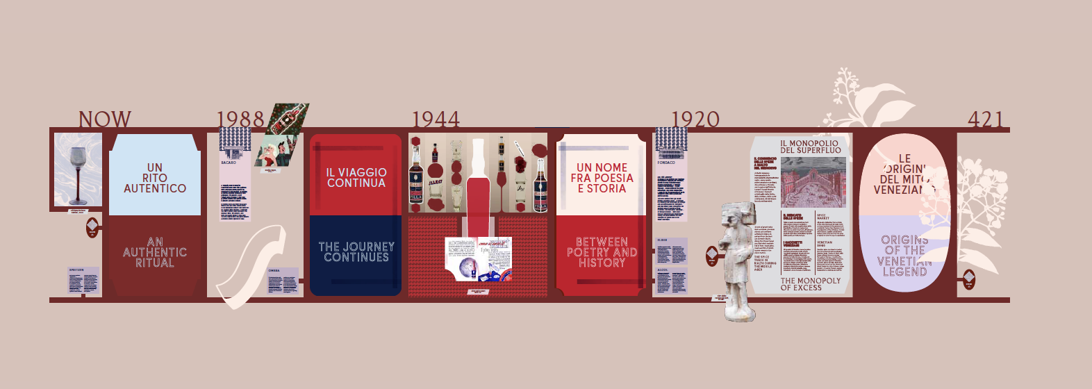
II. SELECT HERITAGE
Historic gallery — A journey through time
III. SELECT VENICE
Adventure game — The labyrinth of wonders
→ go to project
IV. SELECT ALCHEMY
Interactive station — The recipe and production
V. SELECT SECRET LAB
Sensorial experience — The Herbarium and The Machine
→ go to project
The five stages of the exhibition route develop the central themes of the product in an eclectic and complementary manner: the spices and herbs that make up the recipe, its origin in Venice in the 1920s, and the aperitif culture.
Central to the design is the visitor's experience of discovery, providing sophisticated and multi-layered content through a playful, analog, and imaginative approach.
The defining themes are the craftsmanship of processes and the sensory nature of materials, aligning seamlessly with the interior design project.
The various outputs are tied together by a multi-faceted exploration of genuine Venetian elements, driven by our deep connection to the city.
Each stop along the exhibition route is punctuated by audio tracks accessible through QR codes, in which designers and experts expand upon the narrative of the place — curated by Jonathan Zenti.
I. SELECT BAL ORIENTAL
— VIDEO INSTALLATION
On September 3, 1951, Charles de Beistegui hosted the ‘party of the century’ at Palazzo Labia, a celebration of the city's decadent and exuberant spirit. Salvador Dalí, Christian Dior, and other notable guests embodied the theme of the evening: the extravagant and refined Venice of the late 18th century.
Photographs from the event, taken by Cecil Beaton, Robert Doisneau, and Cornell Capa, captured a magnetic and surreal society.
The installation brings the LED wall to life with a sensual kaleidoscope: photographic details come together and disperse, creating a moving wallpaper effect.


View from the ledwall to the historic gallery
II. SELECT HERITAGE
— Historic gallery
The archive-museum of Select tells a story that begins with the origins of Venice and, through the legendary Spice Route, arrives at the culture of modern aperitifs. Each stage of the journey explores the evolution of trade, taste, and narrates the brand's spirit up to the present day.
The eclectic combination of moving images, visual documents, and vintage objects forms a historical wall, blending a business archive with a contemporary wunderkammer.
This narrative timeline includes unseen footage and nostalgic images of an almost vanished Venice, along with glossary terms (elixir, alcohol, ombra, bàcaro, fondaco), to convey a distinctive and unique perspective.


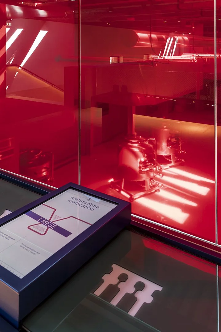
IV. SELECT ALCHEMY
— Interactive station
The interactive table provides insight into Select's production system — from ingredient selection to aroma extraction, maturation, bottling, and tasting of the Venetian spritz.
By sliding the monitor, the user activates the red liquid that gradually fills the animated icons, allowing them to follow the process. Select Alchemy is designed as a precise and immediate educational tool, situated at the production area’s overlook.

CA’ SELECT — space tour
